How you layer colors in acrylic pour art can make or break your masterpiece. Proper layering ensures that your desired hues stand out, while avoiding the dreaded muddy colors that can occur when wrong color combinations mix. Understanding color theory and the interaction between transparent and opaque paints is key.
In this guide, you’ll learn important strategies like alternating transparent and opaque paints and avoiding certain pairings to keep your art vibrant. The process also involves mastering the pouring medium ratio and experimenting with various paint combinations to see what works best. Happy painting!

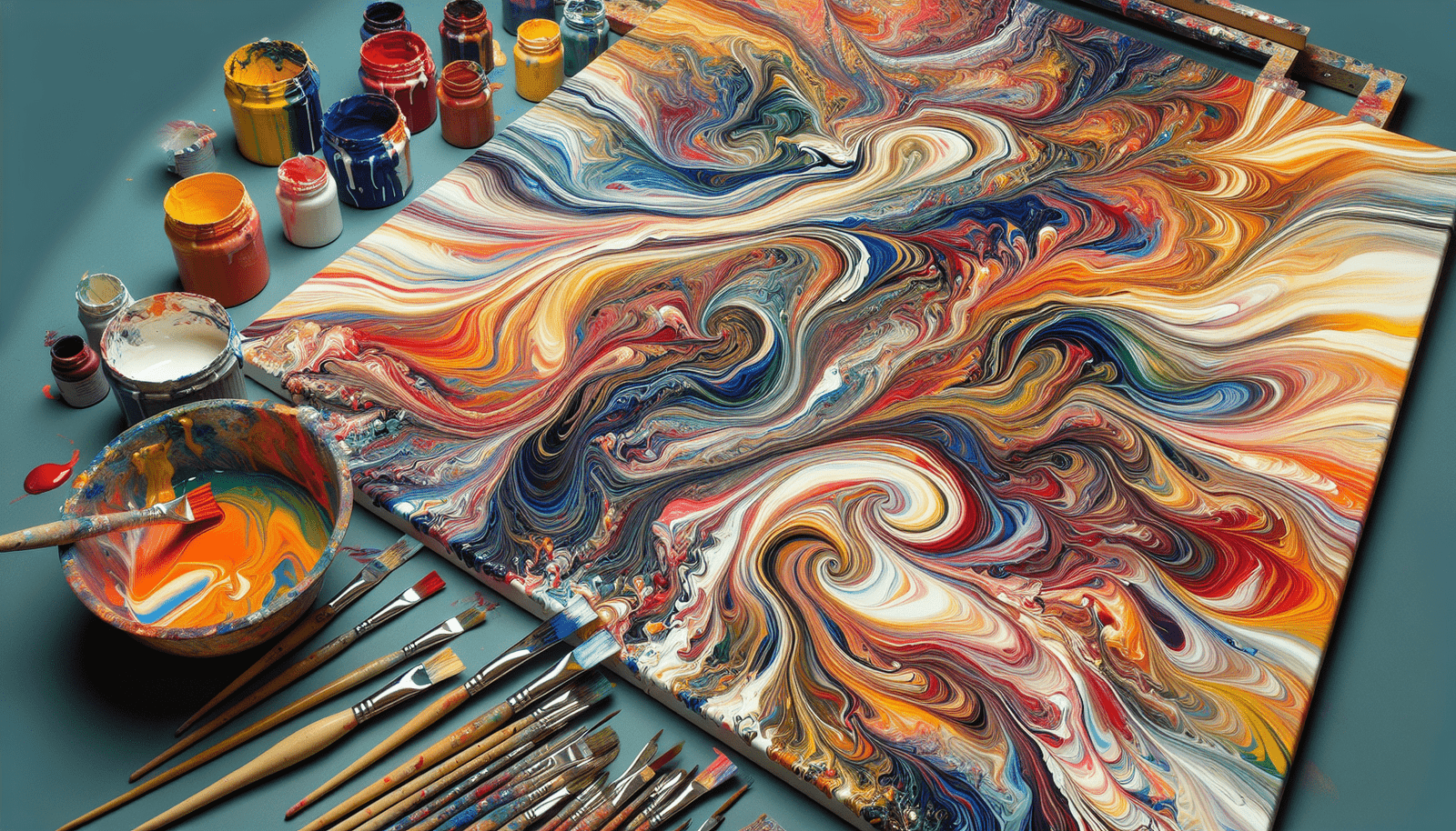
Understanding the Importance of Layering Colors in Acrylic Pouring
Acrylic pouring is much like life – it’s all about making the right choices and letting things flow. You might find it surprising, but how you layer your colors can drastically impact the final result of your pour. Think of it as deciding who sits next to who at a dinner party. You want to avoid conflicts (muddy colors) and ensure everyone complements each other.
Avoiding Muddy Colors
The key to successful layering lies in meticulous planning. When layering your acrylic paints, avoid pairing colors that clash. Muddy colors arise when complementary colors, like red and green, mingle too closely. It’s like watching two people with vastly different viewpoints argue – unproductive and messy.
Enhancing Desired Hues
Conversely, you can amplify the hues you love by placing them strategically. Think of it as giving a supporting role to characters in a novel. By pairing colors harmoniously, you enhance the vibrancy of each without overshadowing the other.
Basic Principles of Color Theory
Color theory isn’t just for art majors; it’s the backbone of creating visually pleasing artworks. Knowing the fundamentals helps you make informed decisions, rather than leaving things to chance.
Color Wheel Fundamentals
The color wheel is your map in the world of colors. Primary colors (red, blue, yellow) form the triadic base. From these, secondary and tertiary colors bloom. Understanding this wheel helps you predict how colors will interact.
Complementary vs. Adjacent Colors
Complementary colors are those directly opposite each other on the wheel, like blue and orange. They create contrast but can also result in muted, muddy tones if mixed. Adjacent colors, such as blue and green, sit next to each other and blend more harmoniously, like friends who share common interests.
Selecting Pleasing Color Combinations
Choosing the right color combination is like curating a playlist; every song needs to contribute to the overall mood without clashing.
Using the Color Wheel
Utilize the color wheel to select combinations that will work well. Experiment with analogous (adjacent) colors for subtlety or triadic schemes (equidistant colors) for vibrancy.
Popular Color Schemes
Popular schemes often include monochromatic, reminiscent of a melancholy afternoon spent alone, and complementary, similar to an intense conversation that leaves you both enlightened and exhausted. Triadic schemes, on the other hand, celebrate diversity and balanced harmony.
Personal Preferences
Your choices should always reflect your personal taste. Art, much like life, is subjective. Trust your instincts and lean into what feels right, even if it defies convention.
Types of Acrylic Paints: Transparent vs. Opaque
The distinction between transparent and opaque paints is crucial. It’s like choosing between showing your cards and bluffing in a poker game; both have their place.
Characteristics of Transparent Paints
Transparent paints allow light to pass through, creating a layered effect and adding depth, much like peering into a relationship and seeing hidden complexities.
Characteristics of Opaque Paints
Opaque paints are bold, blocking light and delivering solid coverage. They’re dependable and assertive, equivalent to a well-laid argument.
Why It Matters in Layering
When layering, mixing transparent and opaque can yield dynamic results. Overdo it, however, and you risk the colors overpowering each other, akin to personalities clashing in a small space.

Techniques for Layering Colors
Creating a melodious artwork requires strategic layering, much like composing a symphony.
Alternating Between Transparent and Opaque Colors
Alternating gives each color a chance to shine. Transparent paints add nuance, while opaques provide structure. It’s a balance of strength and subtlety.
Avoiding Pairing Similar Types with Opposite Hues
Pairing similar types (both transparent or both opaque) with opposite hues can lead to discord. It’s like pairing two introverts or two extroverts; it often needs a mediator for balance.
Utilizing Blockers like White and Black
Blockers such as white and black act as buffers, preventing colors from mixing. They provide punctuation, allowing each color to stand on its own.
Experimentation with Color Combinations
Experimentation is essential. It’s like dating different people to understand who complements you best.
Testing Specific Paints
Before committing to a canvas, test your paint combinations on small tiles. Observe how they interrelate. Does the green overpower the blue, or do they harmonize?
Observations on Various Combinations
Document your observations. Some combinations may surprise you with their harmony, while others could disappoint, not unlike interactions in a social setting.
Effects of Different Pouring Mediums
Different mediums influence the final appearance. Some may cause colors to expand, while others maintain boundaries, akin to different dynamics in relationships.
Pouring Medium Ratios and Consistency
The consistency of your paint mixture is like the tone of a conversation – it can make or break the vibe.
Importance of Proper Ratios
Achieving the right ratio of paint to pouring medium is crucial. Too thick, and the paint may not flow; too thin, and it might bleed into other colors, similar to how clear communication needs balance to avoid misinterpretation.
Impact on Color Layering
The consistency affects how colors layer and interact. A balanced mixture ensures clarity and vibrant layering, much like well-phrased thoughts create meaningful dialogue.
Comparisons Between Wet and Dry Pours
Wet pours blend more freely, allowing colors to mingle before setting, whereas dry pours layer distinctly. Each method has its elegance, akin to different styles of communication.
Tips for Beginners in Acrylic Pouring
Starting with acrylic pouring is like beginning a new journey – it’s exciting but daunting.
Practical Advice on Layering
Start by alternating transparent and opaque colors and use blockers like white or black for balance. Gradually, you’ll find your rhythm and preference.
Common Mistakes to Avoid
Avoid over-mixing complementary colors to prevent muddy results. Also, ensure your paint consistency is not too thick or too thin.
Useful Tools and Supplies
Invest in quality acrylic paints, pouring mediums, and mixing tools. These foundational supplies are like the essentials of any well-prepared artist’s toolkit.
Additional Resources and Tutorials
Embrace every opportunity to learn and refine your craft. Knowledge is your greatest ally.
Choosing Colors
Study resources on color selection tailored for acrylic pouring. The right guide can illuminate your path, helping you avoid rookie mistakes.
Paint Usage and Techniques
Dive into tutorials that cover paint usage, from mixing ratios to layering techniques. Expertise shared by seasoned artists can be invaluable.
Equipment Recommendations
Learn about recommended equipment and supplies to make your process smoother. Having the right tools is akin to having a well-equipped kitchen – it makes all the difference.
Conclusion
Summarizing Key Points
Layering colors in acrylic pouring isn’t just a technique; it’s an art form. Understand the importance of color theory, select harmonious combinations, and experiment persistently.
Encouragement to Experiment
Don’t be afraid to make mistakes. Each pour teaches you something new. Like in life, experimentation leads to discoveries and growth.
Inviting Further Learning
Continue your journey by exploring more resources and tutorials. Every piece of knowledge adds another layer to your skillset, encouraging you to venture deeper into your creative potential.